 |
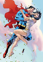
| by George Perez, SUPERMAN #1 |
For the past few weeks, I’ve been living in denial. I knew it was coming, but I held onto that one tiny sliver of hope that
the teaser I saw was an aberration, perhaps a spare, second design to be used only on special occasions. But no.
This is Superman’s new costume. And if you thought the geeks got bent out of shape about
Wonder Woman’s do-over last year, you ain’t seen nothing yet.
For those of you not versed in such matters,
DC Comics is in the process of revealing an upcoming reboot of their universe. In a few months, all of the major DC titles will restart with new #1 issues, in a few cases replacing books that have been running for three quarters of a century, with numberings in super-vision-eyeshot of a thousand. Additionally, most of the characters’ costumes have been either completely redesigned or given some simple “modern” tweaks, in order to make them, according to artist and co-publisher
Jim Lee, “more identifiable and accessible to comics fans new and old.”
Excuse me? “More identifiable?” How is this MORE identifiable than one of the most iconic designs in not just comics, but all of pop culture history?
This is just the latest manifestation of the kind of short sighted
flash(point) over substance that’s defined mainstream comic books for the past decade now. Overarching, complicated “crossover events” dominate DC and Marvel comics, making it nigh-impossible for any casual reader to just pick up a comic book and have any clue what’s happening. To complicate matters further, both publishers have numerous different versions of some of their most popular characters running concurrently. It’s a fucking mess.
 |
| art by George Perez |
So, yes, a periodic house cleaning is not a bad idea. DC’s 1985
CRISIS ON INFINITE EARTHS
streamlined their “multiverse” into one cohesive universe and timeline, but of course, within a decade or so, things became muddled again and thus began a series of tweaks and redefinitions that’s become practically ongoing.
I don’t buy any comic books on a regular basis any more, but I still love the art form and particularly the superhero genre (it’s just that these days, I mostly get my fix from OLD comics and other media adaptations). When I do buy modern comics, it’s usually in the collected trade paperback format, which gather extended storylines under one cover. But even then, the end result is often still so reliant on previous and/or related stories and convoluted continuity that it’s impermeable to the lay reader.
I recently bought Geoff Johns’
FLASH: REBIRTH
, thinking that it was the story of the resurrection of the Silver/Bronze age Flash, Barry Allen, who gave his life to save the universe in the aforementioned CRISIS. I liked what Johns did with a similar storyline in which Barry’s contemporary,
Hal Jordan came back to life and retook the mantle of Green Lantern
.
But as I started reading the book, I realized that Barry was ALREADY BACK, that it had happened in another comic, and that REBIRTH was about tying up all the loose ends that go along with undoing an already Byzantine mythology. By the end of the second chapter, I was so lost that I just tossed the damn thing on my elimination pile (the fact that Ethan Van Sciver’s stiff, clunky art hurt my eyes only added to my enmity).
So the concept of a universe-wide restart isn't the problem itself. And in fact, I WOULD pick up some regular comics (especially with DC’s new lower price point) if I could follow what was going on. But what’s been revealed thus far just feels like they’re going about it in a wrong-headed way.
One of the most successful tweaks of a character was Frank Miller and David Mazzucchelli’s
BATMAN: YEAR ONE
storyline in 1987. Unlike Miller’s
DARK KNIGHT RETURNS
series of the year prior, YEAR ONE was part of the “official” continuity, a slight reworking of the story of the caped crusader’s nascent career and burgeoning relationship with a Lieutenant Jim Gordon. It was a fantastic story, beautifully rendered, and left an impact on the character felt to this day.
And here’s the thing: BATMAN: YEAR ONE wasn’t a mini-series, nor was it the beginning of a renumbering of the character’s titular comic book. The four-part story simply ran in
BATMAN #404 through 407. Nobody was confused, and certainly nobody ignored it. To paraphrase Shakespeare, the story was the thing, not a gimmicky renumbering or costume modification.
 |
| Tim Burton's Superman |
Although Batman’s costume has been tweaked quite a bit over the years. But Batman’s visual look, while certainly distinctive, is more open to interpretation than Superman’s (or Wonder Woman’s, for that matter). The unique elements of the Superman outfit are SO iconic that all previous efforts to significantly alter it have fallen flat (moreso in the movies than the comics).
Superman’s costume HAS gone through slight modifications since he was
introduced in 1938
. The boots, cape, belt and of course, S-shield evolved over the years, settling into the iconic standard by the mid-40s. The specific details have stood the test of time: The M-Shaped double scallop at the top of the boots, the circular belt buckle, the pentagon with the five floating yellow shapes creating the S shape, the tucked-in cape. These may seem trivial, but they’re all intrinsic parts of the whole that, when abandoned, just don’t look right.
So let’s check out this new design. There’s a high collar, that turns the cape's ends into epaulets somehow attached to the neck. We’ve got a ridiculous red (utility?) belt with a superfluous pentagon buckle. Those boots, I have no idea what the hell they are. The armor-resembling calves and knees. The pointless detail piping on the shirt and legs. The bottom arc of the S is no longer rounded. And, perhaps most predictably, the red shorts are no more.
At this point, I’m not sure if this is a Jim Lee redesign or if it was done by
George Peréz (who drew the image, from the forthcoming
SUPERMAN #1). Certainly, it has all the earmarks of an overdone, awkward Pérez design (he may be one of the most popular comic book artists of all time, but his costume designs are the worst… check out
Jericho and Dick Grayson’s first
Nightwing outfit, to name just two). But the S and the high collar scream Lee.
 |
| art by Jim Lee. Meh. |
I have to admit, I am not a fan of Jim Lee’s art. Lee broke out in the 1990s, one of the superstars of the “Dark Age” of comics, when over-rendered superheroes with Schwarzenegger physiques and ridiculous weaponry gritted their teeth and killed anything in their way. This was a period when one of the hottest artists in comics was
Rob Liefeld, a cartoonist with perhaps the worst grasp of anatomy in the history of the medium. While Lee wasn’t as bad as Liefeld, his style of rendering always left me cold, and I’ve noted in recent years that while he’s somewhat adept at drawing muscular, spandex-clad men with facial scruff in their 30s, mechanical devices and vehicles, other than that, he’s lost. His women look like men with grapefruits taped on their chests, his older characters are botoxed to the point of no return and anyone without a hero’s physique somehow still manages to look ripped (his version of the Joker is more comical than Cesar Romero’s).
 |
| art by Gary Frank. Yes! |
Jim Lee became the co-publisher of DC in 2010 alongside
Dan DiDio (with Geoff Johns anointed the Chief Creative Officer). All three of these guys are bona fide fanboys, to be sure (and, FLASH: REBIRTH aside, Johns has written some great comics… his
SUPERMAN: SECRET ORIGIN
was maybe the best version of that oft-told tale I’ve ever read). But they also all seem to lack a faith in the characters whose destiny they currently control.
There’s a reason
Superman
,
Batman
and
Wonder Woman
have lasted uninterrupted for nigh 75 years. They are innately perfect pop culture creations, so distinct at the core that they can be adapted to fit the changing technology and times. But, and here’s the rub, they have all become so much bigger than their comic book incarnations that while DC may own the copyright (for now anyway, in the case of Superman), they don’t own the characters. They belong to the public and the public doesn’t like it when icons are changed, especially if there wasn’t anything wrong with them in the first place (insert overused, but apt New Coke metaphor here).
As with
Electric-Blue Superman and Mullet Superman and
SUPERMAN RETURNS 
Superman, this redesign will hopefully (and probably) turn out to be a temporary aberration (regardless of what costume Henry Cavill’s Kal-El wears in
THE MAN OF STEEL).
Superman’s design appeals to the id, the dramatic combination of simple shapes and primary colors strikes as much a chord within us as his strength of character. It’s not only pointless, it’s flat out demeaning to think that he needs an “update” or has to get rid of his red shorts because they’re “silly” or not cool. Superman is beyond all that. He’s Superman.
 |
| art by Drew Struzan. Awesome. |


2 comments:
Obviously my feelings on this aren't as passionate, but speaking strictly from a design/art standpoint, that new design is rotten, as is the drawing you selected to illustrate it. The anatomy is fucked, the (typical) absence of any bulge in the crotchular region, the awkwardness of the pose. Rubbish. I think it was drawn using an action figure as a model. Feh, meh and all that. Pyoo.
I enjoyed this article. I agree with you on many points.
Post a Comment