Friday, April 29, 2011

Crisis on Earth-1993

From the ages of about 4 to 29, I had one specific career goal: To draw comic books. Specifically, to draw DC Comics comic books. For two and a half decades, I practiced, studied, drew and worked towards that goal. I even published some of my own comics (initially with my best friend Nathan as my writing partner, then later doing full duty as writer-penciler-inker-letterer) in preparation for the gig.

In 1993, I finally felt ready to give it a shot and packed up my portfolio and traveled to New York for a portfolio review with the publisher of the characters I loved the most. In addition to my own comics, I included prepared samples of pages featuring Superman, Batman, Green Lantern, the Justice League and other DC heroes.

Some of the pages were unfinished pencils, some were fully inked. I also did a few pin-up style drawings, even though I knew that’s not what editors are looking for when they review artists’ work. They want to make sure that you know how to tell a story, not draw a pin-up, but since those iconic posing covers of the Bronze age were one of the things that made me love DC Comics so much, I threw some in anyway.

I think I also wanted to show that I could letter, and, honestly in retrospect, maybe that’s what I should’ve pursued. I was never more than an average artist at best, but at lettering? Immodestly, I'll say that I think I'm a pretty damn good letterer. Sadly, of course, lettering is now almost always done on computer, and so it’s pretty much a moot point.

Anyway, the outcome was meh. My work was greeted with encouragement, but not really enthusiasm. According to the editors I saw that day, I had a good grasp of storytelling and perspective, and a nice eye for detail, but my draftsmanship needed work.

And of course, they were right. There are some pretty stiff figures in these pages, and I still can’t draw machinery or anything mechanical to save my life.

But instead of continuing to develop my superheroic craft, I moved on. But part of the reason was that in 1993, comics were hip-deep in the so-called “Dark Age” of gun-toting anti-heroes delineated by the likes of Rob Liefeld and Todd McFarlane, driving my interest in the genre to an all-time low. I was far more into alternative comics like LOVE & ROCKETS and EIGHTBALL, and so I decided to focus on that aspect of cartooning, where I’ve had a wee modicum of success over the years.

To be honest, I’m not sure why I’m posting these. Certainly I put a ton of work into these pages, but today, more than a few of them are pretty embarrassing. I guess maybe after all these years, I finally feel enough distance to document the last gasp of a dying dream without it hurting too much!

I’m putting this stuff here rather than on Tough Guy (my art site) because they’re so old, and really not representative of the kind of work I try to do today. I don’t want people to judge me based on these pages. Not that I could do better than this today, I’m so out of practice as far as this stuff goes that I have no idea how I’d do if I sat down to draw a straight superhero page today.

This is not to say (in case it needs to be said) that I’ve lost interest in drawing superheroes. Even a cursory look at Tough Guy quickly reveals that’s not the case. But my dream of doing superheroes professionally has shifted from appearing in ACTION COMICS to contributing to BIZARRO COMICS (if it ever gets resurrected) or doing a comics-themed spot illustration for WIRED or ENTERTAINMENT WEEKLY or getting a chance to continue my PRINCE STREET NEWS comic strip for COMIC BOOK ARTIST.
In any case, for the first time anywhere (except for the Batman origin, which was on Tough Guy before I moved it here), here are the pages I took to DC Comics that day (most of them, anyway… there are a few that, even in context, aren’t worth posting). Click on any of the pieces for a larger version (if you DARE!).

I guess I should do some annotating, especially for the non-geeks in the audience.

BATGIRL
This faux-ad was a little prescient. This was a period after Barbara Gordon had retired from being Batgirl, but before anyone had taken up the mantle to take her place. I thought it would be a cool idea to have someone take the identity without Batman’s sanctioning, and he would be none too pleased. But then again, when is Batman too pleased? One of the main reasons I did this page was to highlight costume design (I made up the very early-90s costume that Batgirl is wearing). In these nascent computer days, I was still using press-on letters for things like the blurbs at the top and the bottom. The Batgirl logo was press-on type enhanced with hand-drawn extensions. Oh, and zip-a-tone. I LOVED zip-a-tone.


BATMAN SAVES ROBIN (pencils only)
Robin tries to reason with two Gotham City toughs while a third plans to drill him with her gat! Luckily, Batman is nearby. Eh.


THE JOKER’S CRYING
Reason enough to summon the Batman to Arkham Asylum, no? A really bad Batmobile and some really stiff figures, but I thought it was pretty decent storytelling. The concept was stolen from an Alan Moore issue of SWAMP THING, by the way.


TIM LIKES DINOSAUR JR.

I wanted to draw a few domestic scenes, as I presumed that most portfolios the editors saw were weighted towards fight scenes. What I didn’t realize at the time (since I apparently had stopped reading BATMAN regularly) was that the new Robin, Tim Drake, wasn’t Bruce Wayne’s ward, that he had a father (who has since been killed off). Whoops. I still like the idea of Bruce Wayne only listening to his father’s music (which was jazz), that once his parents were killed, he had no time nor desire to cultivate his own taste in popular culture. Again, the lettering’s the best stuff here. Sigh.


LEGENDS OF THE DARK KNIGHT
This was designed as an ad for a speculative issue of LEGENDS OF THE DARK KNIGHT in which Batman somehow encounters versions of himself as portrayed in film and television. The missing lettering was done on computer, printed out and rubber-cemented onto the art. Which of course means that it’s long gone (hence the gray streaks at the bottom).


BATMAN ADVENTURES (pencils only)
Bruce Timm’s monumental BATMAN animated series was only about a year old when I did these pages, and his sleek amalgam of Alex Toth and Jack Kirby was just starting to influence comic book art. DC’s THE BATMAN ADVENTURES was a youth-oriented adaptation of that cartoon, and this and the next page were (sort of) done in that style (although the Joker and Harley are really off-model). I do recall that first panel got some praise for the use of perspective.


BATMAN ADVENTURES (pencils only)
Oof, that big creature is one horrible design. This was done to show action and page flow. The only thing I really like about it is that last panel insert of Batman standing over the felled villain.


THE LEGEND OF THE BATMAN
Again in the style of the animated series (a bit more on-model than the others, but still not right on), this is a fairly straight adaptation of the classic two page origin from 1939’s DETECTIVE COMICS #33. The Batman logo was based on the art deco logo for the series, but I drew it by hand. A real mixed bag, I detest those last four panels. Yeesh.


THE FLASH (pencils only)
Another pin-up, mostly included because the plane and the car actually don’t look THAT bad. Oh, and the logo wasn’t done by hand, it was Xeroxed from a FLASH cover and pasted on.


GREEN LANTERN TRAINING SESSION
Oboy. Aside from Hal Jordan, Kilowog and Sinestro, don’t look for any of these other members of the Green Lantern Corps in this summer’s movie; I made ‘em up. From left to right, we have African-Planet-Female-GL, Insect-Horse-GL, Blind-GL-wth-Tiny-Seeing-Eye-GL and Nerd-Planet-GL. I’m not sure, but I seem to recall it was in my head that it wasn’t really Sinestro attacking them, but a training construct or something. Doesn’t matter. These pages suck!


JUSTICE LEAGUE SQUABBLES AGAIN (pencils only)
In the late ‘80s / early ‘90s, the Justice League was going through some real identity crises (no pun intended), with the roster and tone of the book constantly shifting. During this period, there was an awful lot of Marvelesque in-fighting going on at their HQ, and I decided to draw one of those squabbles. The roster here is Fire, Bloodwynd, Martian Manhunter and Guy Gardner. If you don’t know who they are, don’t worry about it (although to date, only Bloodwynd hasn’t appeared in an animated series…. Aw).


DR. SIVANA’S UNSTOPPABLE MONSTER (pencils only)
A bunch of DC superheroes team up to stop a monster created by Captain Marvel’s arch-nemesis Dr. Sivana in this five-page story. I’m not that good at monsters (as we’ll see again later), nor is Mary Marvel my forte. Tell you what I CAN draw as well as anyone on this planet, though, and that’s Superman’s S-shield. I musta’ drawn that effin’ thing fifty thousand times in my life. Anyway, I kinda like the Daily Planet scenes and the last panel on page 4, but other than that… again, meh.


DR. SIVANA’S UNSTOPPABLE MONSTER (page four inked)
Of the five pages, I only inked and lettered this one. By the way, Batman? Really hard to get right, as you can tell here.


PHANTOM LADY
Faux-cover done for the Quality Comics character acquired by DC. She’s best known for her headlights, as they were once so quaintly called. This was done to showcase another costume redesign.


ROSE AND THE THORN
Faux-ad, again primarily to showcase costume redesign (That’s not an exposed nipple-less right boob, that’s a neck-high top that’s a different material than the leathery stuff to the right of the thorns… oh, never mind) and lettering (the logo was done by hand). Man, that sweatshirt on Rose is atrocious.


SUPERGIRL (pencils only)
That’s Lex Luthor in the beard. That’s his girlfriend, the non-Kryptonian Supergirl in the biker shorts (another costume design that hasn’t aged well). So much backstory here, I don’t even know where to begin, so just won’t even bother (the Superman titles were pretty complicated at the time). Look it up if you want. More stiffness, but again a pretty decent storytelling flow. I guess.


LOIS AND CLARK LOUNGE
Another domestic scene, and a homage to the first Superman film. And apparently, Lois Lane had a problem with a bad receding hairline in the early 1990s.


SUPERMAN AND THE RECKLESS PHOTOGRAPHER (pencils only)
I still kinda like this one.


SUPERMAN SAVES THE AFRICAN VILLAGE
Another bad monster / alien design. The fist punch is okay, though. And I NAILED the S! Heh.


SUPER INSPIRATION
This was a page for a full-length Superman story that I wrote called “Clothes Make the Man” about the iconic power of Superman’s costume. In this segment, a fashion designer is struggling with his new line until he sees a news story about Superman, which inspires him to create an entire line of clothing based on Superman’s costume. Would probably look better in color. And not in the early ‘90s.


CLARK STANDS UP LOIS

More really stiff anatomy (the crooks in that last panel make me wince, but Superman’s okay there) and the women’s faces are pretty angular and harsh. But I do like the idea. And look how nice Superman’s S looks!


So, thanks for taking the time to look at my portfolio. What’s that? Don’t call you, you’ll call me? Ah, crap. Rejected again.
_____________________________
all characters are ©DC Comics, Inc.

Saturday, April 23, 2011

It is the Wrong 'em Boyo!

I have spent much of my four and a half decades on this Earth acquiring things. I am a “collector,” as they say, of numerous aspects of popular culture: Music, comic books, action figures, movies, Superman memorabilia and Creature from the Black Lagoon stuff, to name just a few obsessions.

Of course, as with most collectors, issues of money, space and/or a waning of interest can cause periodic purges. Over the years, I’ve gotten rid of more than half of the comic books I’ve bought, and the records and CDs I’ve sold number in the thousands (although probably most of them I got for free). Trying to keep a collection balanced and free of chaff is an ongoing process.

The collector’s mentality being what it is, however, it’s not uncommon for regret to rear its ugly head down the road, and many geeks / nerds / whatever epithet you prefer often find themselves shelling out big bucks to replace something they at one time decided was mere detritus. And it’s usually at a loss. (And this is a wholly separate issue than re-buying beloved childhood items that were destroyed from use… Major Matt Mason, I miss you!).

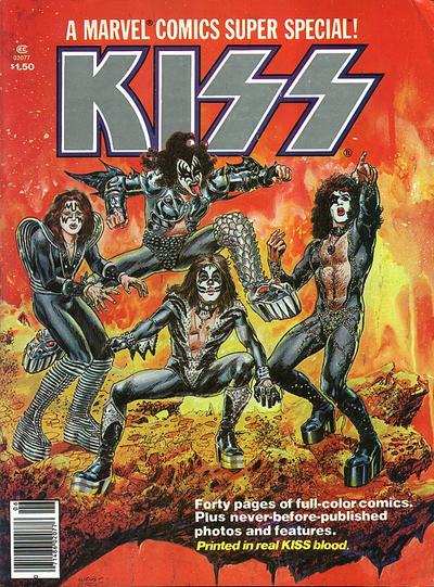
I have to say, for the most part, I haven’t come to regret losing most of what I’ve purged. There are exceptions of course (Oh, MARVEL SUPER SPECIAL #1 starring KISS, what was I thinking???).

Although there is one specific item from my past that I wish I still had more than any other, and it’s something that’s so rare, I only came across an image of it on the internet last week (after searching for it many times over the years).

It’s the so-called UK “Subway” promo poster for the Clash’s self-titled debut album from 1977. This monster measured about three by five feet, reproducing the black and white photo from the cover of the record, with fluorescent pink logo and fuzzed out typewriter lettering running across the top declaring “NEW ALBUM… NEW ALBUM… NEW”. At the bottom was a white banner for promoting a live show.

The image here is slightly different than my poster in that mine didn’t promote the Swansea University show (at least I don’t think it did), and this jpeg has been rather sloppily retouched on Paul Simonon’s and Mick Jones’ legs using some digital program.

My poster was also torn, a big chunk was missing from the bottom… or top, again, I can’t exactly recall… but that was okay, it made it even more punk rock.

I also can’t remember where I got the damn thing. I’m pretty sure I was in high school, and I think I picked it up at a record store for a dirt cheap price due to its condition. And while certain details remain fuzzy, I DO know why I don’t own it any more.

No, I didn’t sell it. It wasn’t stolen. I didn’t lose it in a fire or a flood. I gave it away. To a GIRL.

She shall remain nameless not to respect her anonymity, but because I can’t remember what girl it was. I think it may have been that girl who had the pet rats. I know that, like myself, she liked the Clash. And since I’m fairly certain I wanted to kiss her, I thought maybe the pot would be sweetened by offering up a token of my affection. Whether I reached my kissing goal or not is lost to the brain wrinkles. I’m gonna guess No.

In a life that, like everyone’s, has seen its share of bad decisions along with the good, this one ranks pretty high. I know, lucky me, one of my “worst decisions” revolves around a POSTER that I gave away. Guys in jail are cryin’ me a river.

But today, in my middle-aged, perpetually arrested adolescence, oh how I would love to have that fuckin’ thing framed and hanging on my wall between the SUPERMAN: THE MOVIE one-sheet and the original Dan DeCarlo art from the cover of ARCHIE’S JOKE BOOK #101.

How much would I pay to replace this great, lost icon? Hard to say. If the day ever comes where I actually find a copy for sale, it might be relative to how much I had in the bank at the moment. Or it might have more to do with my emotional state at that particular juncture. We nostalgics tend to lose perspective (and besides, who needs to eat that much, anyway?).

But Rat Girl… if you’re out there… and it was you… and you still have it… you know where to find me.

POSTSCRIPT, MAY 2011:
Shortly after writing this post, I did another search on eBay and found a smaller version of this poster for $6.00. Sold. Okay, so it ain't exactly the same, but for now, at least, it's close enough...

Monday, April 18, 2011

Batman vs. Superman

This is an oldie but a goodie from 2006 when I went geek-to-geek with Jon Wilde and Bob Fingerman on the age-olde and ridiculous geekgument as to who would win in a battle, Batman or Superman? My account of the event is here, but I thought I'd embed the video here and post it because I think it may have been the last time I pontificated on the tee-vee!


Thursday, March 24, 2011

Toy truck lacks verisimilitude

I saw this on eBay the other day, and remember having it as a kid. I also remember, even as a child, thinking that in the comic world of Metropolis, this newspaper delivery truck would be highly unlikely, unless it was the crux of a story in which someone in DAILY PLANET distribution discovered Superman's secret identity, had the design department make a sign revealing said information graphically, and then got it manufactured and put on the side of the delivery van.

But if the goal was nefarious, then wouldn't the designer of the sign have made the headline something less celebratory? Maybe something like, "Man of Steel Causes Millions in Structural Damage Battling Giant Robot!" or "Property Taxes Rise Again Thanks to Stupid Alien!"

Or, maybe this was from one of those "Imaginary Stories" from the 1960s where Clark Kent is revealed to be Superman and Perry White decides it'll be a great boon to circulation to publicize the fact that the Man of Tomorrow is on their staff!

Or maybe the designers at Corgi just didn't care about making their Daily Planet Van believable within context! I am sure that Richard Donner did not approve.

Saturday, March 19, 2011

Man DOWN! (Kissing the ass of the crappy beer drinker)

There are few things more pointless to complain about than advertising, especially beer advertising, but every once in a while, a commercial riles me to the point of distraction, and talking about it is the only way to cleanse my mental palate.

Such is the case with a current Miller Genuine Draft 64 commercial entitled, “Toast.” A member of a wedding party seated at the head table is vainly attempting to get the guests’ attention by tapping his glass of wine with his knife. Noticing the wan sound, a cocky blonde groomsman to his left asks what he’s drinking.

“64 Calories of Pinot Grigio,” he responds awkwardly (I don’t think I’ve ever felt the urge to point out the caloric content of any beverage in any context, but I understand the need for speedy exposition, so I’ll go with it).

“Yeaaah,” the other guy sneers, handing off his bottle of MGD 64. “No self-respecting drink should make a sound like that.” The groomsman tries again, and as he taps his knife on the beer bottle, a much louder tink echoes through the banquet hall, garnering the attention of all.

The implication here is that the wine drinker is a pussy—especially after his speech subsequently bombs—while the hale fellow downing the MGD 64 is a man’s man. Aside from the asinine implication that wine—even Pinot Grigio—is not a worthy choice of wedding beverage, all this commercial proves is that a beer BOTTLE has more mass than the relatively thin wine glass. If the impotent (presumably) groomsman were drinking coffee, he’d have wiped the floor with the MGD 64 drinker.

But the whole point of light beer commercials (and MGD 64 is just light beer with a more masculine sounding name marketed to guys) is to try to make the drinkers of the watered-down brew feel like they’re drinking real beer, and thus are real men. It’s a pathetic, transparent ploy, but the sad fact is, as someone who serves lots and lots… and lots… of light (and “lite”) beer to overgrown frat boys, it works.

Taste in all things being subjective, I’ll still make the daring statement that from a savory standpoint, light beer sucks. The only reason to choose a Diet Bud (as I sometimes call it) over a “Bud Heavy” (which I never, EVER call it) is because you’re worried about your waistline. There’s a time and a place for such concerns, and when you’re talking about the difference between actually enjoying a tasty, hoppy brew and sucking down a pale, watery semblance of same, Beer O’Clock is not it. Have a salad instead of fries, or a glass of water instead of a Coke. Life’s too short to compromise on the truly important things. And I’m only being slightly sarcastic.

Miller Lite’s equally-grating “Man Up” commercials pretend that theirs taste better than other light beers, but that kind of qualitative claim isn’t held up to any legal standard. In this series of ads, über-hot female bartenders viciously mock male customers who don’t care how their light beer tastes (and carry man-purses or buy antiques). What makes those commercials teeth-gratingly annoying isn’t the bitchy bartender, it’s that if you’re going to tell a patron to “man up,” you’re not going to suggest a different light beer; you’re going to slap a Guinness and a two shots of Knob Creek in front of him, down one of the shots, then charge him for everything.

But, in another aspect of advertising that annoys me to no end, there’s no gender swap version of the “Man Up” ads, and not just because there’s no feminine version of the phrase (although I’d argue that “Man Up” could work in this context just because I think women should drink like men, too). We’re not going to see a commercial where the bitchy, self-entitled fashion victim is berated by the hunky bartender for having no light beer preference because (a) it’s somehow acceptable for girls to choose drinks by caloric content alone and (b) funny commercials cannot hinge the gag on men demeaning women.

The other risible aspect of the “Man Up” ads is how they encourage the kind of frat boy mentality that leads to nonconformists getting the shit beaten out of them after last call. While I’m certainly not going to defend dudes who carry so-called “Man Purses,” or 90% of the people trying to squeeze into skinny jeans, making fun of them in the context of a Miller Lite ad just feels… dickish. Which is, I’m sure, just what they were going for. Advertising isn’t stupid; it’s a carefully calculated science, and these people know to whom they’re talking and how to talk to them.

A similar case of demographic ass-kissing is seen in the Keystone Light commercials featuring the “always smooth” Keith Stone, a facially-scruffed, trucker cap-wearing dude who hangs out in convenience stores munching ten-foot long meat snacks and rescuing comely damsels-in-distress. These ads are mildly amusing, even though their goal is to affirm that beer-bellied white trash guys are completely justified in wearing their “No Fat Chicks” shirts under their puffy vests. The mere fact that Keystone Light is the official beer of the NASCAR Camping World Truck Series (I don’t even know what that IS!) instantly negates any and all possibilities of “smoothness.”

But most beer commercials can be boiled down to simple Pavlovian response. COORS = BOOBS. CORONA = BEACH. PABST BLUE RIBBON = ANNOYING HIPSTER. Okay, so that last one isn’t officially marketed yet, but give it time.

Again bowing to subjectivity, the beer commercials that offend me the least tend to be for the beers I enjoy the most, and those commercials are usually about the taste of the beer rather than the image they carry. Sam Adams actually explains how their distinctive brews get their flavors; The Dos Equis “Most Interesting Man in the World” ads have a smart balance of parody and patronization. Guinness commercials need only display close-up beauty shots of the heavenly concoction settling in a sweaty pint glass to get its connoisseurs’ mouths watering.

Yet I still pine for the as-yet unrealized beer commercial that would put the male light beer drinker in proper context:

OPEN ON: CHAD, FRESH OFF WORK FROM HIS JOB IN FINANCE PUSHES HIS HAIR INTO HIS PARTY-TIME MINI-FAUXHAWK AND PUSHES THROUGH THE CROWD AT THE BAR, WAVING HIS CREDIT CARD, TRYING TO GET THE ATTENTION OF THE BUSY RED-HEADED BARTENDER, JOSIE.
CHAD: Yo, I need a beer!
JOSIE IGNORES CHAD AND CONTINUES TO WAIT ON THE QUEUE OF CUSTOMERS AHEAD OF HIM.
CHAD: What’s this chick’s problem, anyway? YO!!!
JOSIE SHOOTS A STINK-EYE IN CHAD’S DIRECTION WHILE WAITING ON SOMEONE ELSE. SHE FINISHES THE TRANSACTION AND FINALLY GETS TO CHAD.
JOSIE: What can I get you?
CHAD: Whattya got light in a bottle?
JOSIE: Well, if you’d have taken five seconds to survey your surroundings, you’d have noticed a display of all of our bottled beers right behind me, including a handful of tasteless light beers, any of which I’m sure will serve the purpose of getting you wasted enough to justify date raping whatever superficial bimbo impressed enough with your enormous clanking gold watch to follow you home to your art-and-book-free condo, while simultaneously giving you less to worry about when you “hit the gym” tomorrow morning before returning to your soulless, money-grubbing career where you’ll look at porn at your desk and rally your boys to go somewhere to watch the game and grab some ‘za tomorrow night.
CHAD: (Pause) Gimme a Miller Lite.
JOSIE: Did you want to start a tab?
CHAD: No, just run it.
JOSIE: We have a $20 minimum on cards.
CHAD: Whatever.
ANNOUNCER: MILLER LITE! Your taste in everything else is lousy, so what the fuck.

Last Call!

Friday, February 18, 2011

Flaming foam heads at Disneyland and Hitler action figures.

As a rule, I steer clear of internet message boards, both posting and reading. The usually banal, petulant, grammatically challenged, unedited blatherings of the highly opinionated (yet oddly often uninformed) denizens of the virtual world just depress me as we wind our way quickly and decidedly towards Idiocracy. But every once in a while, I’ll forget my rule and toss a few thoughts on some pop culture related board, usually regretting the foray into the troll-crammed morass.

A few weeks ago, when Marvel Comics killed off Johnny Storm, aka the Human Torch of their cornerstone superhero group, the Fantastic Four, I posited a theory on the Comic Book Resources message board, subject-lined “Anyone smell Disney in this?” I suggested that perhaps Marvel Comics’ parent company (as of 2009) wasn’t too keen on the flammable superhero, harking back to a false rumor in 1978 that the DePatie-Freleng Saturday morning FF cartoon ditched the Torch for H.E.R.B.I.E. the robot for the same reason. If the day comes where Spider-Man, Wolverine and the Hulk mingle with Mickey, Donald and Goofy in the forms of giant wandering foam-costumed characters at Disneyland/World/Galaxy/Universe, maybe a big flaming guy trying to hug the tots would instill more terror than joy.

Of course, I was mostly joking. But I set off an instant firestorm (no pun intended - besides, that’s a DC superhero). Rabid Marvelites immediately sprang to the company’s defense, claiming that Disney has absolutely NO say on anything that happens at the so-called House of Ideas, that the storyline that killed Johnny was planned before the House of Mouse even bought Marvel, and most of all that the artistes in control of the Marvel Universe would never, ever, EVER do anything for commercial purposes! It’s all about the ART!

Well… Okay. Let’s tackle these responses one by one.

• Disney has no say as to anything that happens at Marvel. Then, could someone explain to me why, for absolutely no narrative reason whatsoever, in December, concurrent with the release of Disney’s TRON: LEGACY, a bunch of Marvel Comics featured variant covers depicting their heroes clad in futuristic, glowing TRON-style costumes? What, Marvel did it on its own accord as a show of camaraderie towards its new overlords? Disney may not be sitting in on editorial meetings, but anyone who thinks they’re not taking some sort of role in their new acquisition is simply naïve.

• The storyline was in the works for years. As I haven’t read FANTASTIC FOUR in about 25 years, I’ll just have to take the fanboys’ word on this one. Like I said, I was mostly joking.

• Marvel Comics places Art over Commerce. Ahem. Okay. Fanboys seem to live in a myopic vacuum where, perhaps because they’re aware that comic books just don’t sell that much anymore, they think that the publishers aren’t beholden to any kind of corporate bean counters, that they just create art for the fans, and if it sells, it sells, if it doesn’t, well, nobody cares.

It's true that, in the case of Marvel and DC (and probably Archie and Dark Horse and a few other publishers), comic books are loss leaders that exist primarily to perpetuate and create characters that can be licensed for merchandise and media, where the real money lies. Batman movies and T-shirts and action figures and mugs and masks et al allow DC to publish the seemingly endless stream of comics featuring the various and sundry Batmen cluttering up their universe these days. But the bottom line still matters. The tale of the (no doubt temporary) demise of the Human Torch may have been masterfully told. I don’t know, and frankly, don’t care. But I do know that killing off a major character sells books, and I’m sure that was the reason that Marvel let it happen.

But let’s talk about another, more sinister case of the bottom line dictating story in the context of a Marvel character.

In March of 1941, nine months prior to America entering World War II, the cover of CAPTAIN AMERICA #1 pictured the red-white-and-blue superhero slugging Adolf Hitler, proving that Joe Simon and Jack Kirby’s character knew who the enemy was before Roosevelt did. While he wasn’t the only, or even the first patriotic superhero, Cap embodied America’s battle with the Axis powers more than any other comic book character before or since. Captain America’s arch-enemy, the Red Skull, was Hitler’s head of espionage, sabotage and other terrorist activities against the Allies.

But in the upcoming movie, CAPTAIN AMERICA: THE FIRST AVENGER, the Red Skull (Hugo Weaving, best known as Agent Smith from THE MATRIX) is an agent of HYDRA. HYDRA (it’s not an acronym, but it is capitalized) is the Marvel Comics criminal organization bent on controlling the world, with roots that stretch from ancient Egypt through Nazi Germany and ancient Japanese ninja orders. But HYDRA is not a Nazi organization.

The first clue came when early information on the film referred to the Red Skull as an agent of HYDRA, which, in the comics, didn’t exist during WWII. Then late last year, the Disney XD cartoon, THE AVENGERS: EARTH’S MIGHTIEST HEROES (which is a great show, by the way) aired an episode set in the 1940s, with Captain America fighting the Red Skull, an agent of… HYDRA. The cartoon made it clear that it was HYDRA, not the Axis powers that overran Europe and pulled America into the war. And Disney's pretty big on corporate synergy (I'll make an early prediction that the Hulk in the Avengers movie will be the talkative version of the unjolly green giant).

There’s a lot of debate right now as to whether the Nazis will even be mentioned, let alone depicted in CAPTAIN AMERICA. Thus far, the images released depict nary a swastika, while the Red Skull and his minions bear HYDRA patches and symbols. The imdb cast listing doesn’t have anyone playing Adolf Hitler -- or Mussolini or Hirohito for that matter (as a curious side note, in Captain America’s last film, a 1990 straight-to-video disaster, the Red Skull was a scarred Italian musical prodigy, but he still worked for the Nazis!). But IF the Nazis are completely excised from the film, Paramount and Marvel run the risk of CAPTAIN AMERICA being prejudged as a whitewashed trifle, regardless of whether it’s a good movie or not (of course, much of the film's young target demographic doesn't even know who we fought in WWII, so at least they won't give a crap).

There are obvious reasons for Paramount and Disney/Marvel to not want Hitler in their kid-friendly wannabe blockbuster. It’s hard to market a movie in certain parts of Europe if that dark period of history is treated lightly or in a fictionalized genre setting. But an even bigger reason is that licensees of CAPTAIN AMERICA need to be able to use the bad guy as well as the hero and it’s kinda hard to get swastika-emblazoned toys on the shelves at Target (although Walmart might not have a problem).

Marvel’s official stance is that it doesn’t matter what precise brand of fascism Captain America fights, that he’s a symbol of freedom in the face of all tyranny. But this feels like a case of rationalizing the substitution of the Third Reich for HYDRA. It’s hard to imagine that in the halls of the house that Stan & Jack built, there’s not a little bit of consternation over this major alteration of Cap’s backstory.

Let me point out that I'm not one of those closed-minded, hardcore fanboys who doesn't understand that movie adaptations need to change certain elements of their source material to fit the different media. Christopher Nolan's Batman needs all that bulky armor. I get it. But as I've said many times, there should be a sense of respect paid to the legacy of the character.

In the comic book world, there are few absolutes. Characters die and come back to life all the time, the laws of physics are mutable, and superheroines’ bra cup sizes fluctuate wildly between D and DD. But when you’re dealing with characters that have evolved into icons, certain elements of their stories become set in stone. Superman’s powers come from being born on Krypton, but his values come from being raised in Kansas. Bruce Wayne becomes Batman to avenge his parents’ murder. Hulk smash. And Captain America, in World War II, battles the Nazis.

‘Nuff Said.

POSTSCRIPT, April 2011:
So, as more information is leaking about CAPTAIN AMERICA: THE FIRST AVENGER (or, as it will be known in foreign markets, simply THE FIRST AVENGER so as not to alienate any anti-Americans who probably won't notice the character's red-white-and-blue—and, uh, brown—costume or realize what it represents), one rumor is that the Red Skull starts as a Nazi, then defects to HYDRA because they have a cooler logo. Or something like that. Hey, I'm at least relieved to know that the movie won't completely erase the Axis powers. But we shall see how this thing goes over. I smell a potential lead balloon.